How to access Course Activity Insights
If you have been approved for access to CAI in your course, you will be able to add it through your ICON course settings.
To enable CAI in your ICON site:
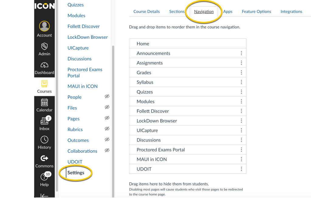
- Go to Settings in the left side navigation column.
- Select Navigation on the top navigation bar.
- Scroll down to find Course Activity Insights.
- Click the vertical ellipsis and select +Enable.
- Make sure to Save these changes.
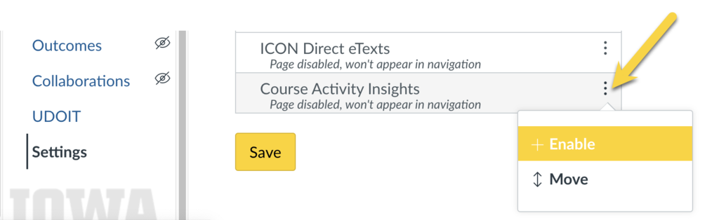
- Course Activity Insights will now appear in the left side navigation column on your ICON site.
How to navigate Course Activity Insights
When CAI is active in your ICON course navigation there are two ways you can access the information:
- Click individually on each of the panels in the initial screen.
- Use the menu labeled Pages that lists the pages.
Getting the most out of Course Activity Insights
These practices represent optimal strategies for instructors using CAI:
- Organize course materials into modules so that students understand when and why to use them.
- Include all graded assignments in the ICON Gradebook, use due dates, and create assignment groups to understand and filter different types of student performance.
- Embed external links within modules to determine that students have navigated to an external resource (e.g., YouTube, educational webpages, etc.).
- Confirm that the course UICapture folder is labeled in this specific format: Semester Year - Subject:Course Number:Section. For example, Fall 2023 - PSY:3570:0001. This folder is tied to the name of your ICON course so if you change the default name of the ICON course, you will not be able to access video data.
Functions of Individual Pages
Who are my students?
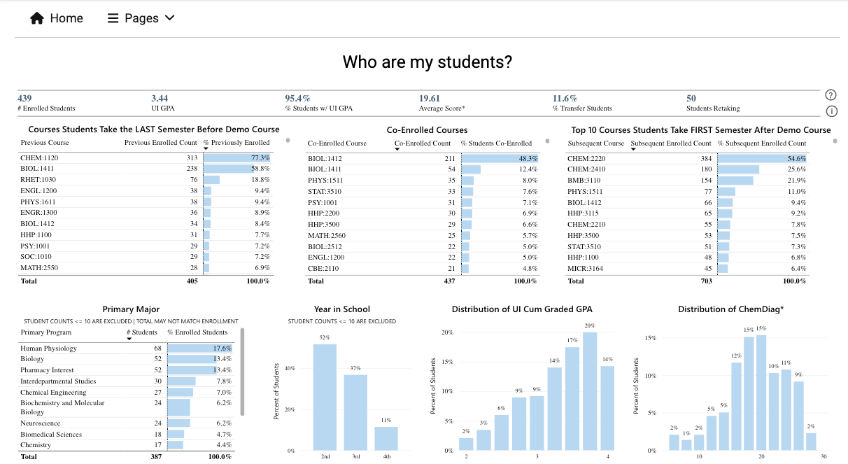
Aggregated information about students’ academic backgrounds including past performance, their primary fields of study, and courses they’re co-enrolled in.
The table at the top of this page provides an overview including number of enrolled students, average UI GPA, percentage of students with a UI GPA, average diagnostic score, percentage of transfer students, and number of students retaking the course. Generally, the diagnostic score is only included if there is a diagnostic test associated with the course (e.g., ALEKS for math courses, chem diagnostic score for chemistry courses).
The next set of three graphs in a row display information about the courses students took in the previous semester, the courses they are currently co-enrolled in, and the top 10 courses that enrolled students took after completing this course in the past. This provides context for where students are in terms of the coursework they have completed or are working through. All the information on this page is drawn from students currently enrolled in the course with the exception of the “Top 10 Courses Students Take FIRST After (x) Course” graph which draws on the cohort enrolled in the previous four semesters of the course to determine which courses were taken the semester after completion.
The final row of graphs displays distributions related to academic information such as primary major, academic year, UI cumulative graded GPA, and diagnostic score (if applicable). Some of these graphs can be clicked to filter the course enrollment information in the three graphs above. Because of this, in cases where there are less than 10 students in a category, these categories are omitted to protect student privacy.
When are my students using ICON?
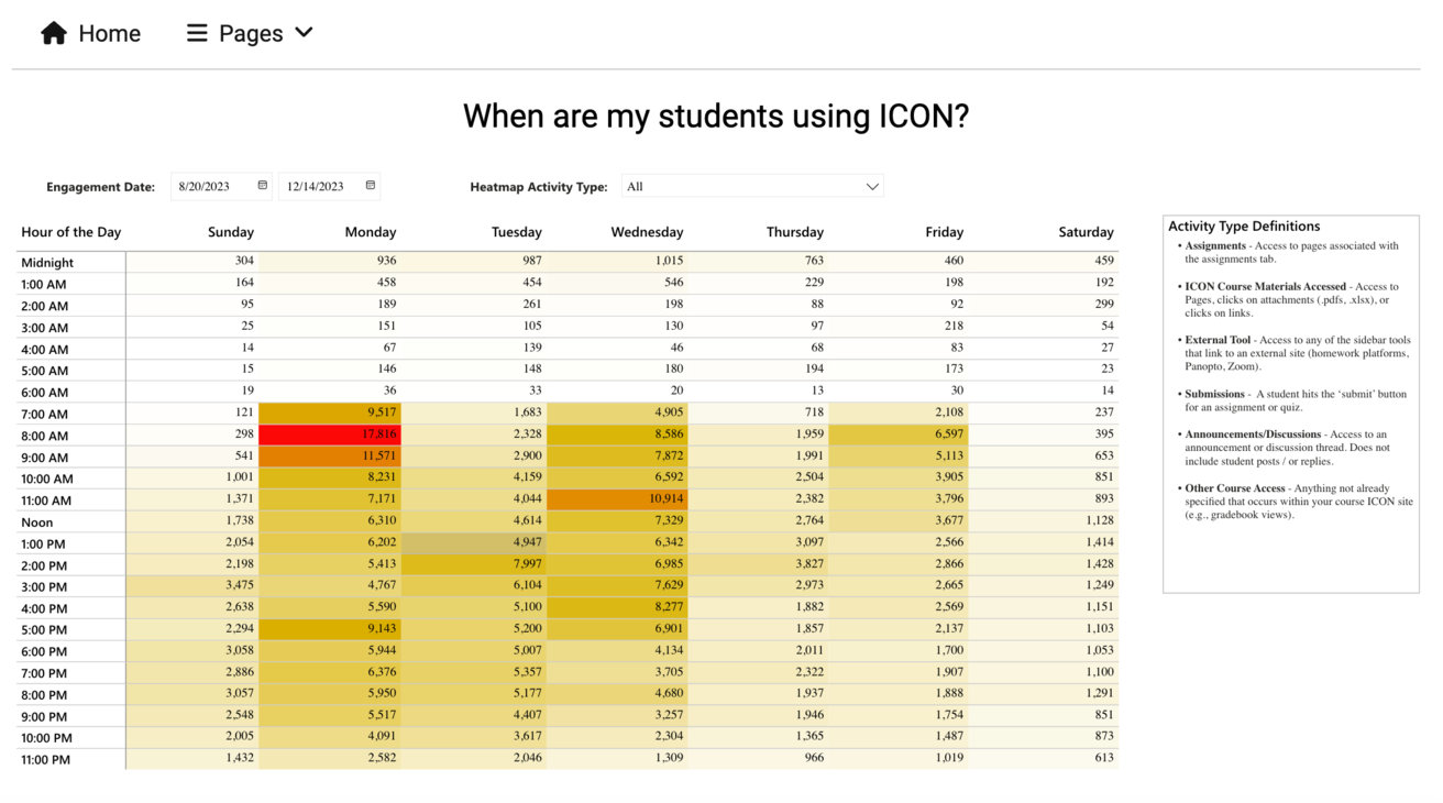
This page provides insights into the times when students are engaged with your ICON course site and what types of activities occur. In the top left corner, the Engagement Date fields can be set by the user to filter to the timeframe of interest. The Heatmap Activity Type dropdown menu can be modified to view specific activities in ICON. The data is color-coded, with darker shades indicating higher activity. To understand what the different types of activities are, view the Activity Type Definitions on the right of the page.
Course Component Relationships
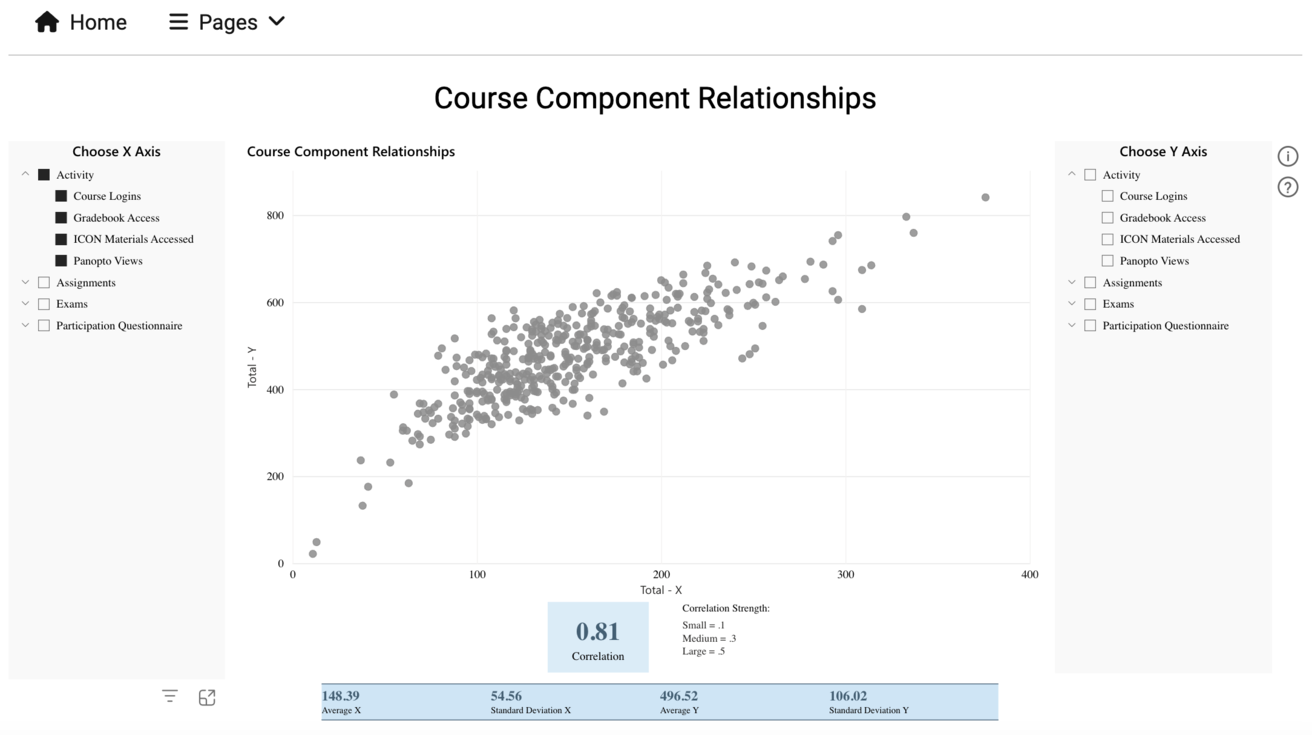
This page examines the correlations between engagement metrics and course results. For example, you can gain insight about how homework performance and exam performance may relate to each other.
On the left and right sides, there are options to choose the X and Y axes respectively. On the X and Y axes, you can select to view the Activity category which consists of four types: Course Logins, Gradebook Access, ICON Materials Accessed, and Panopto Views. In addition, you can select from the assignments that appear in your ICON Gradebook. If you use assignment groups, the assignments will be grouped into those categories accordingly.
In this example, Assignments, Exams, and Participation Questionnaire were the assignment groups created by the instructor. Each of these categories can be expanded to select and examine specific assignments/assessments. If you do not select any categories for an axis, the default “selects” everything. For example, in the graph above, the Y-axis represents the sum of all values (activity and assignment scores).
At the bottom of the page, the correlation is displayed and there is also a table with some summary statistics based on what is selected for the X and Y axes.
Assignment Progress
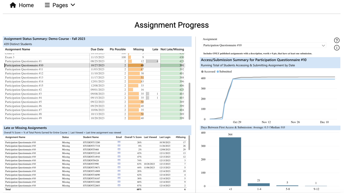
This page identifies students who might have overlooked a crucial assignment. Instructors can get a sense of whether students have begun an assignment or might be falling behind. Keep in mind, this page generally only displays information for assignments that are worth points and have a due date in the ICON Gradebook.
The first section in the top left labeled Assignment Status Summary, lists assignments in a course with their due dates, points possible, and the number of students who are missing or late on the assignment. The section directly below labeled Late or Missing Assignments lists students that are missing or late on a particular assignment. Note, if you do not select an assignment in the top left table, then the default will show all students missing or late on any assignment.
Sometimes, you may have longer form assignments and provide materials directly on the assignment page for students to review as they work through it (e.g.,a semester-long project with examples of previous students’ work). In cases like this, it may be valuable to understand how students interact with the page associated with the assignment before finally submitting it. The section, on the right, labeled Access/Submission Summary for (Assignment X) can help in cases like this and is completely separate from the section on the left. In the Assignment dropdown menu, you can select which assignment to view. Assignments will only be listed here if there is some text in the description on the assignment page in ICON.The line graph shows the running total of students who access an assignment page for the first time (in gray) and the day they finally submitted assignment (in blue). The bar graph in the bottom right is the same information in a different format: it shows the number of students that submitted the assignment based on categories of time (e.g., within the same day they viewed the assignment page for the first time, 9 to 12 days after they viewed the assignment page for the first time, etc.).
In this example, the bar graph above demonstrates that the vast majority of students (364) accessed and submitted this assignment within the same day, which is expected given the nature of this assignment. In courses with longer form assignments, one might expect that students access an assignment page for the first time a few days or weeks before they ultimately submit it.
Engagement with Learning Tools
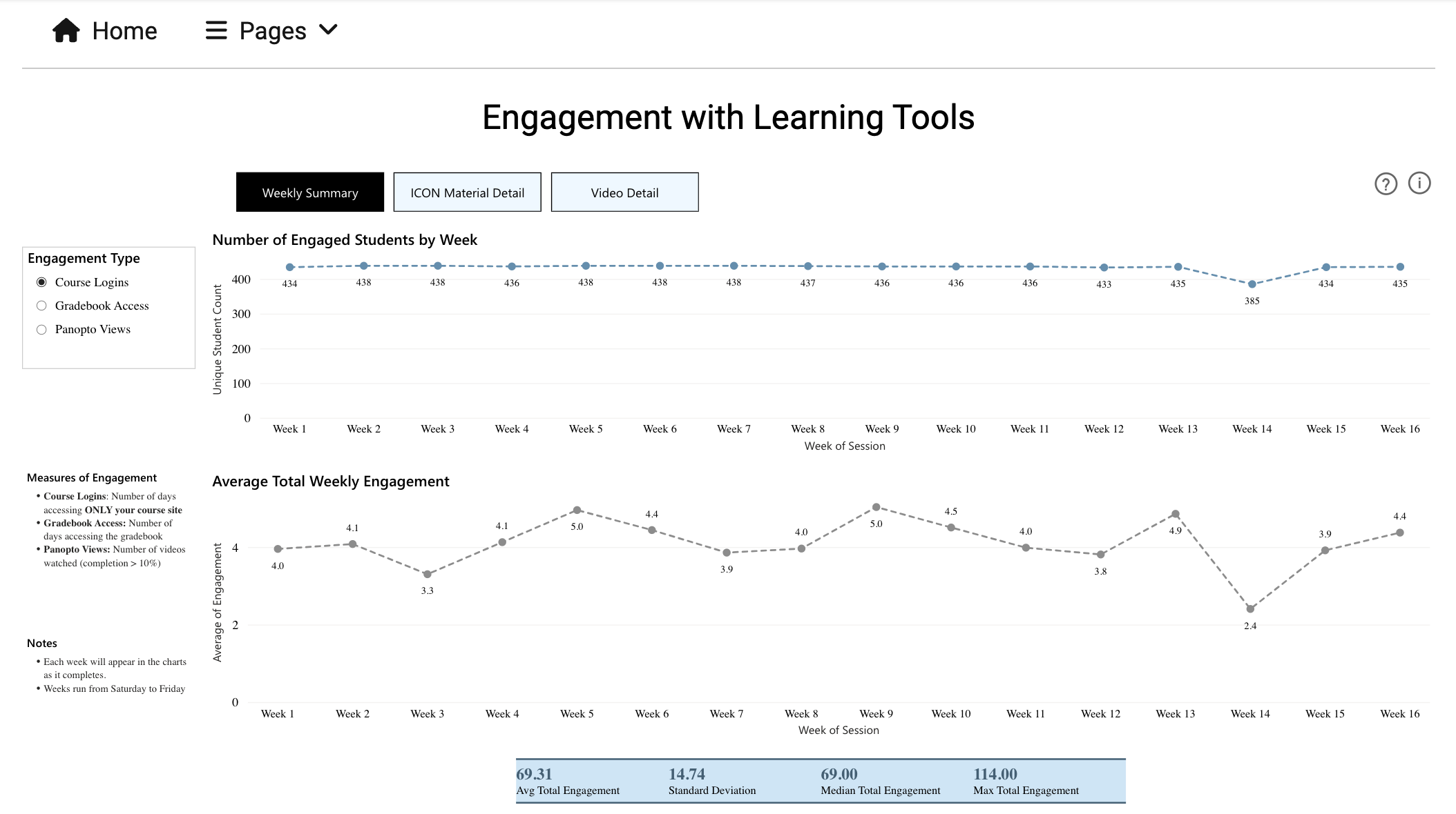
This page informs instructors about how students are utilizing key course resources available to them in ICON such as UICapture (Panopto), lecture slides, and uploaded practice materials.
There are three tabs that can be selected at the top of the page. The Weekly Summary gives a broad overview of activity from week to week. You can select the engagement type on the left. The blue line graph at the top generally reports the distinct count of students that engaged in the selected activity at least once during the week. The gray line graph at the bottom generally reports the average number of times the student engaged in the selected activity each week.
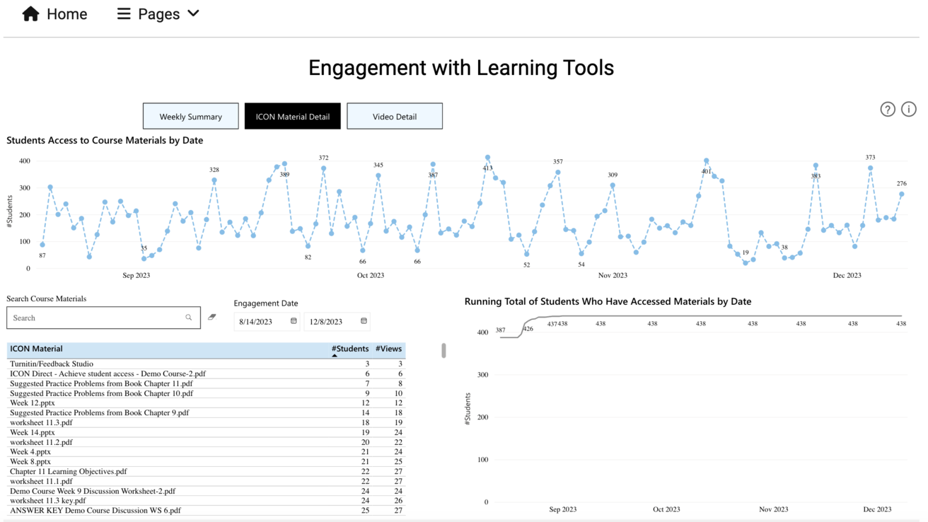
The ICON Material Detail and Video Detail tabs share a similar format with each other. The line graph at the top, shows a timeline with the number of students that accessed course materials each day. In the bottom left corner of the page, there is a table that lists course materials (such as attachments uploaded by the instructor) and external tools integrated with the ICON course site (such as Top Hat launches or Gradescope). Individual materials can be selected to filter the line graphs on this page (note, the default behavior of this platform selects all available options if no specific material is selected). There is also a search bar to lookup materials by name. Using the Engagement Date fields, Instructors can select a range of specific dates on this graph to view course materials accessed within that timeframe.
The last graph, which is located on the bottom right of the image labeled Running Total of Students Who Have Access Materials by Date, shows the cumulative student engagement over time. In this example, 438 students had accessed at least one of the ICON materials by the first day in September.
Student Activity
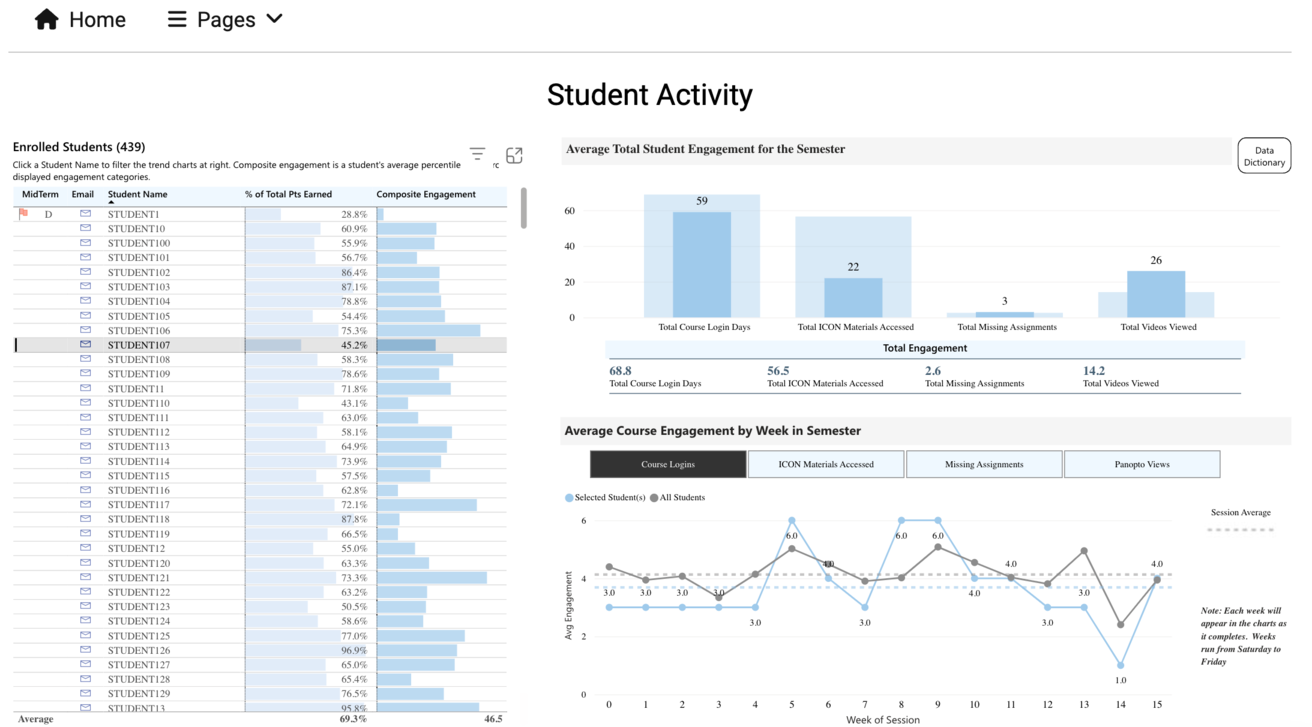
This page provides information on individual student engagement with various course components. Information like this can be useful when preparing to meet with a student who has requested office hours to tailor guidance/feedback based on what students are already engaging with.
The number of currently enrolled students is listed at the top left of the page. The graph on the left side of the page includes the student's name, percentage of total points earned, and a composite engagement score (a student's average percentile rank across the displayed engagement categories on the right side of the page). By selecting a specific student, this will filter the information in the two graphs on the right.
In this example, Student107 has been selected. The bar graph on the top right displays the level of engagement for Student107 (in deeper blue) compared to the average level engagement in the course as whole (in lighter blue) in each category. The categories currently included are Total Course Login Days, Total ICON Materials Accessed, Total Missing Assignments, and Total Videos Viewed. The line graph, located in the bottom right of the page, labeled Average Course Engagement by Week in Semester compares the student selected, Student107, represented by the blue line, to all the students in the course, represented by the gray line. This line graph can display aggregated data for Course Logins, ICON Materials Accessed, Missing Assignments, and Panopto Views by week.
FAQs and Contacts
Why can't I see Course Activity Insights as an option in the Navigation tab?
The LTI was not added to the course. Make sure you are looking at the correct course and contact ITS-RA@iowa.uiowa.edu, if it does not appear in the Navigation tab.
I’ve added Course Activity Insights in Navigation but when I log in, why don’t see any data or why do I see an error?
The Workflow form that allows access could need to be approved by your supervisor or Research & Analytics. Contact ITS-RA@iowa.uiowa.edu
Why can't I log into Course Activity Insights?
This is an issue that can occur based on the browser you are using. Either refresh your current browser or open a different browser, like Edge. You can read more about this issue and troubleshooting solutions on the support page. Contact ITS-RA@iowa.uiowa.edu if the problem persists.
Who can I contact about technical issues?
For technical issues or feedback, please contact ITS-RA@iowa.uiowa.edu.
Have Questions?
We deliver a holistic view of student learning experiences and provide actionable insights.